Visualizations
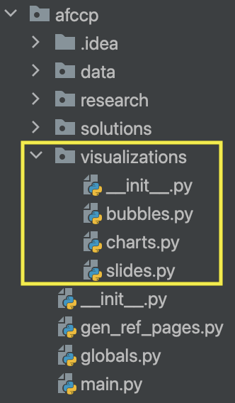
I've created many visualizations for this problem to view the results from our solutions that we generate. A very easy way of generating these charts and then saving them back to the "Analysis & Results" is with the function below. This will automatically generate some "typical" charts that I like to look at, and then subsequently save them back to our solution-specific folder.
As a reminder from earlier, anytime you want to work with a specific solution that you've generated you need to "activate" it. Additionally, when you run the below function to generate/save the charts for a specific solution (in this case "GUO") a new solution-specific folder is created in the "Analysis & Results" folder. The name of the folder will be the same name as the solution. This is where our charts are saved to.
Let's start by loading the data back in using our standard initial methods
# Import the "Random_1" instance
instance = CadetCareerProblem('Random_1')

# "Activate" a particular set of value parameters (since you can have multiple)
instance.set_value_parameters("VP")  # There could be "VP", "VP2", "VP3", etc.

# In case you change some parameter that the value parameters depend on
instance.update_value_parameters()  # AFSC quotas are a good example here

# From now on, this becomes one of your "default" functions to apply!
instance.incorporate_rated_algorithm_results()

# Always make sure your data is good to go!
instance.parameter_sanity_check()
💻 Console Output
Importing 'Random_1' instance...
Instance 'Random_1' initialized.
Incorporating rated algorithm results...
Rated SOC Algorithm Results:
USAFA Fixed Cadets: 1, USAFA Reserved Cadets: 0, ROTC Fixed Cadets: 2, ROTC Reserved Cadets: 4
USAFA Rated Alternates: 0, ROTC Rated Alternates: 7
Sanity checking the instance parameters...
Done, 0 issues found.
Basic Charts
Now we can activate our solution and save all the normal charts! For this small, fake dataset, I have added the parameters below to help adjust the mechanics of these charts since I'm used to instances with 2500+ cadets and ~36 AFSCs. The text, for example should be a bit bigger! And then I have to sort the AFSCs properly for random data.
# Activate GUO solution
instance.set_solution('GUO')

# Generate the standard charts that I track
s = instance.display_all_results_graphs({'bar_text_size': 25, 'skip_afscs': False, 'text_size': 25, 'sort_by_pgl': False})
💻 Console Output
Solution Evaluated: GUO.
Measured exact VFT objective value: 0.8718.
Global Utility Score: 0.8364. 3 / 3 AFSCs fixed. 4 / 4 AFSCs reserved. 7 / 7 alternate list scenarios respected.
Blocking pairs: 4. Unmatched cadets: 0.
Matched cadets: 20/20. N^Match: 20. Ineligible cadets: 0.
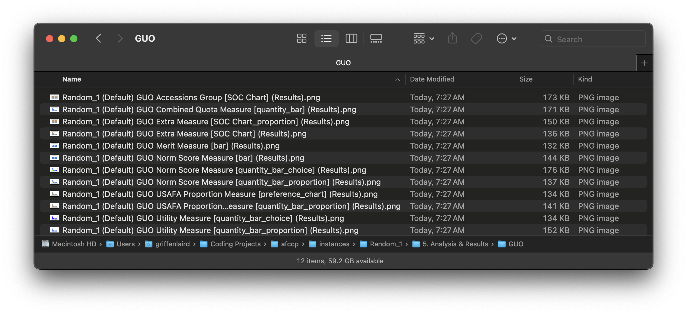
Saving all solution results charts to the corresponding folder...
<Objective 'Combined Quota' version 'quantity_bar'>
Saved Random_1 (Default) GUO Combined Quota Measure [quantity_bar] (Results).png Chart to instances/Random_1/5. Analysis & Results/GUO/.
<Objective 'Norm Score' version 'quantity_bar_proportion'>
Saved Random_1 (Default) GUO Norm Score Measure [quantity_bar_proportion] (Results).png Chart to instances/Random_1/5. Analysis & Results/GUO/.
<Objective 'Norm Score' version 'bar'>
Saved Random_1 (Default) GUO Norm Score Measure [bar] (Results).png Chart to instances/Random_1/5. Analysis & Results/GUO/.
<Objective 'Norm Score' version 'quantity_bar_choice'>
Saved Random_1 (Default) GUO Norm Score Measure [quantity_bar_choice] (Results).png Chart to instances/Random_1/5. Analysis & Results/GUO/.
<Objective 'Utility' version 'quantity_bar_proportion'>
Saved Random_1 (Default) GUO Utility Measure [quantity_bar_proportion] (Results).png Chart to instances/Random_1/5. Analysis & Results/GUO/.
<Objective 'Utility' version 'quantity_bar_choice'>
Saved Random_1 (Default) GUO Utility Measure [quantity_bar_choice] (Results).png Chart to instances/Random_1/5. Analysis & Results/GUO/.
<Objective 'Merit' version 'bar'>
Saved Random_1 (Default) GUO Merit Measure [bar] (Results).png Chart to instances/Random_1/5. Analysis & Results/GUO/.
<Objective 'USAFA Proportion' version 'quantity_bar_proportion'>
Saved Random_1 (Default) GUO USAFA Proportion Measure [quantity_bar_proportion] (Results).png Chart to instances/Random_1/5. Analysis & Results/GUO/.
<Objective 'USAFA Proportion' version 'preference_chart'>
Saved Random_1 (Default) GUO USAFA Proportion Measure [preference_chart] (Results).png Chart to instances/Random_1/5. Analysis & Results/GUO/.
<Objective 'Extra' version 'SOC Chart'>
Saved Random_1 (Default) GUO Extra Measure [SOC Chart] (Results).png Chart to instances/Random_1/5. Analysis & Results/GUO/.
<Objective 'Extra' version 'SOC Chart_proportion'>
Saved Random_1 (Default) GUO Extra Measure [SOC Chart_proportion] (Results).png Chart to instances/Random_1/5. Analysis & Results/GUO/.
<Other Charts 'Accessions Group' version 'SOC Chart'>
Saved Random_1 (Default) GUO Accessions Group [SOC Chart] (Results).png Chart to instances/Random_1/5. Analysis & Results/GUO/.
The instance.display_all_results_graphs()
method will generate several useful charts that can help visualize the various metrics and properties of one particular
solution. I have a predefined set of graphs in the
initialize_instance_functional_parameters() function that will be
constructed here. At the time of writing, this snippet is on lines 212-223 of afccp.data.support:
# Subset of charts I actually really care about
"desired_charts": [("Combined Quota", "quantity_bar"),
                   ("Norm Score", "quantity_bar_proportion"),
                   ("Norm Score", "bar"),
                   ("Norm Score", "quantity_bar_choice"),
                   ("Utility", "quantity_bar_proportion"),
                   ("Utility", "quantity_bar_choice"),
                   ("Merit", "bar"),
                   ("USAFA Proportion", "quantity_bar_proportion"),
                   ("USAFA Proportion", "preference_chart"),
                   ('Extra', 'SOC Chart'),
                   ('Extra', 'SOC Chart_proportion')],
This is part of the initialization of the mdl_p dictionary. I have a weird naming convention that made sense to me
at the time but essentially each kind of chart has an "objective" its associated with and a "version". "Combined Quota",
for example, is the objective to meet the PGL. The version shown is the "quantity_bar" because that was my way of
having the axes be relative to total cadets. Anyway, none of this matters all that much to you, but all these charts
will be saved to your "instances/
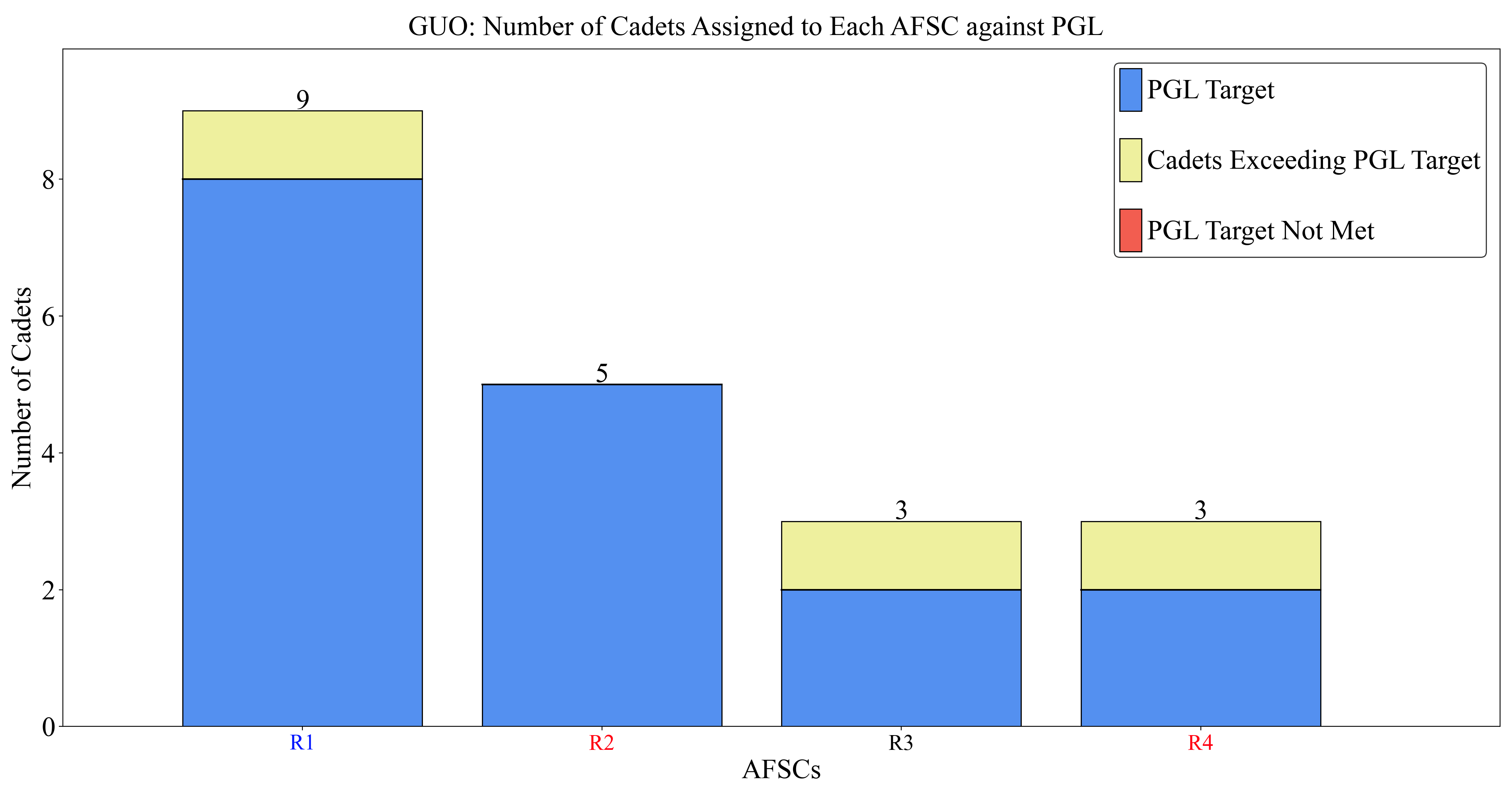
The first chart I'll show is the standard PGL visualization. AFSCs are sorted by their PGL quantities, and the chart shows the number of people assigned to each AFSC, and whether we met the PGL exactly, went over it, or fell short. Additionally, the AFSCs are colored by "accessions group" (Rated, USSF, or NRL). Rated AFSCs are red, USSF is blue, and the remaining non-rated line (NRL) AFSCs are black. In this case, we had four AFSCs with PGLs of 8, 5, 2, and 2. The total PGL target quantity is 8 + 5 + 2 + 2 = 17, so we have 3 extra people to assign. In this solution, we give one extra person to "R1", "R3", and "R4".
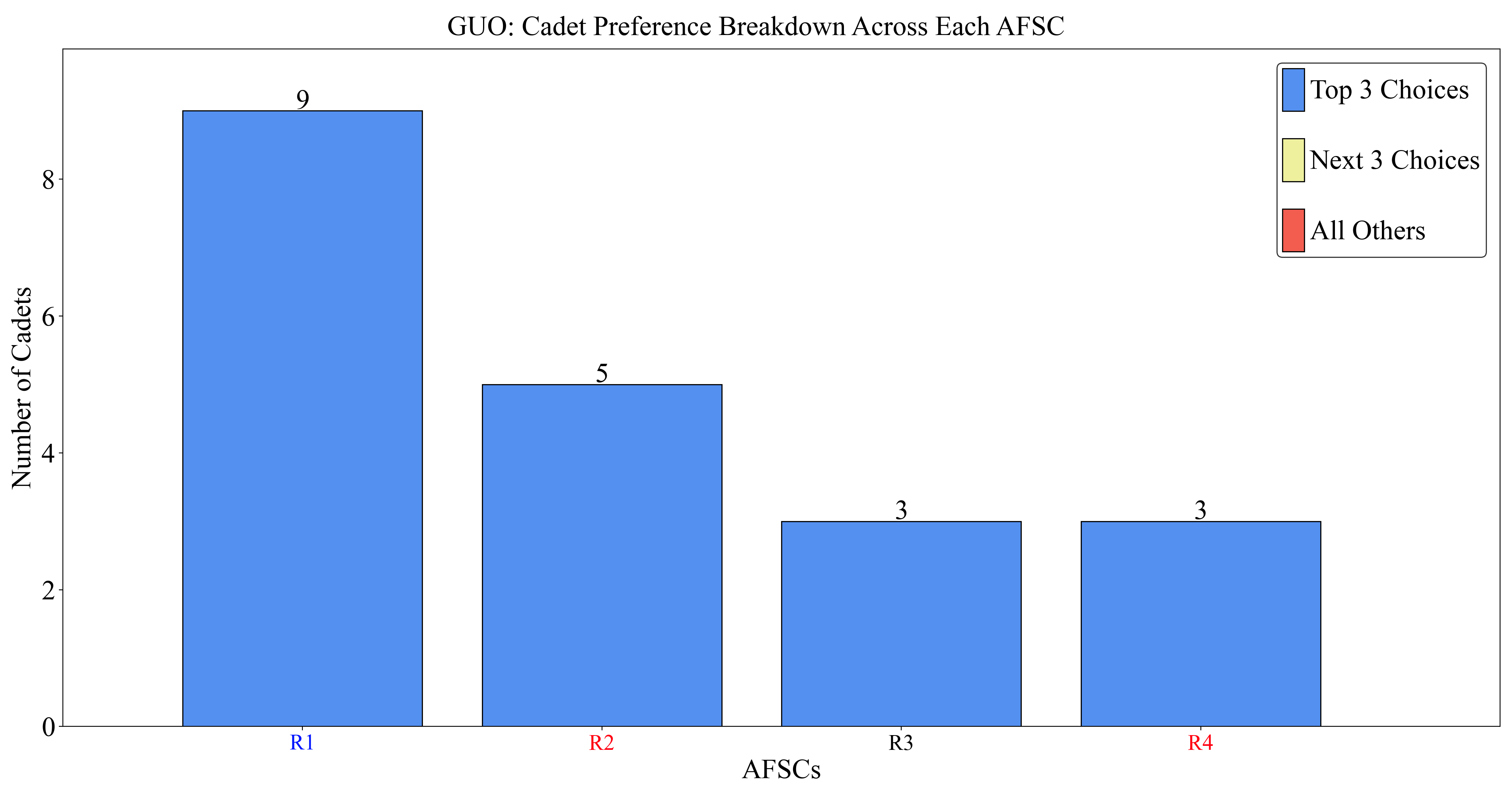
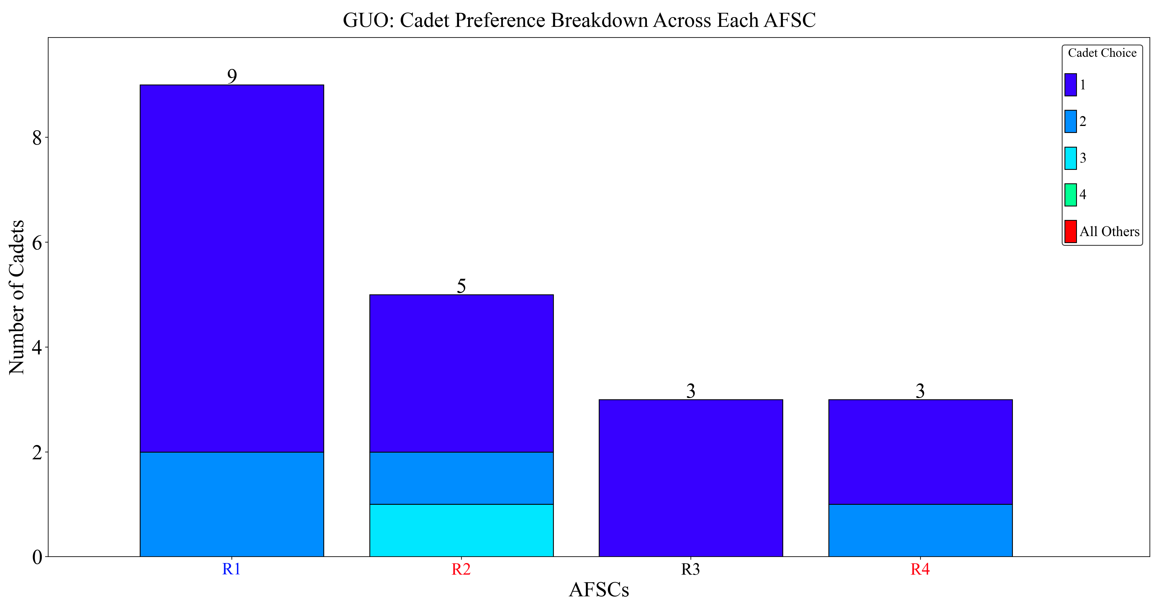
To visualize cadet preference, we have a few different ways of doing it. We can bin cadets together into how many received an AFSC in their top 3 choices, "next 3" (4 -> 6) choices, or everything else. For this solution, they all received a top 3 choice AFSC. This is also because there are only 4 AFSCs total!
We can get a little more granular and show individual choice by 1st, 2nd, 3rd, ..., 10th, everything else too. Again, this isn't too helpful since there are only 4 AFSCs!
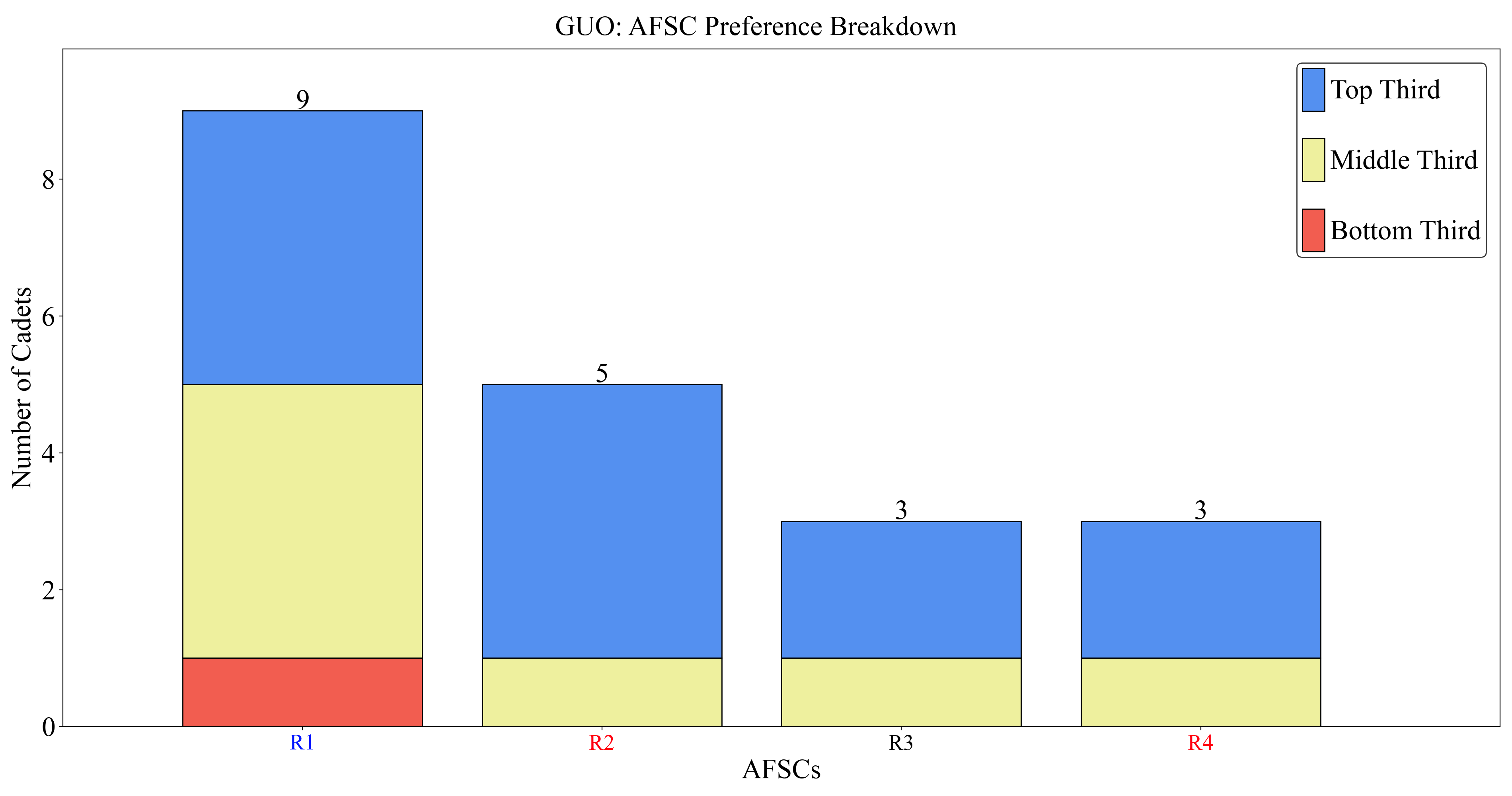
For AFSC preference, we can also bin cadets into where they fall in the rankings by top third, middle third, or bottom third!
To be more granular like we did with cadets, we can expand the bins by looking at 10% increments.

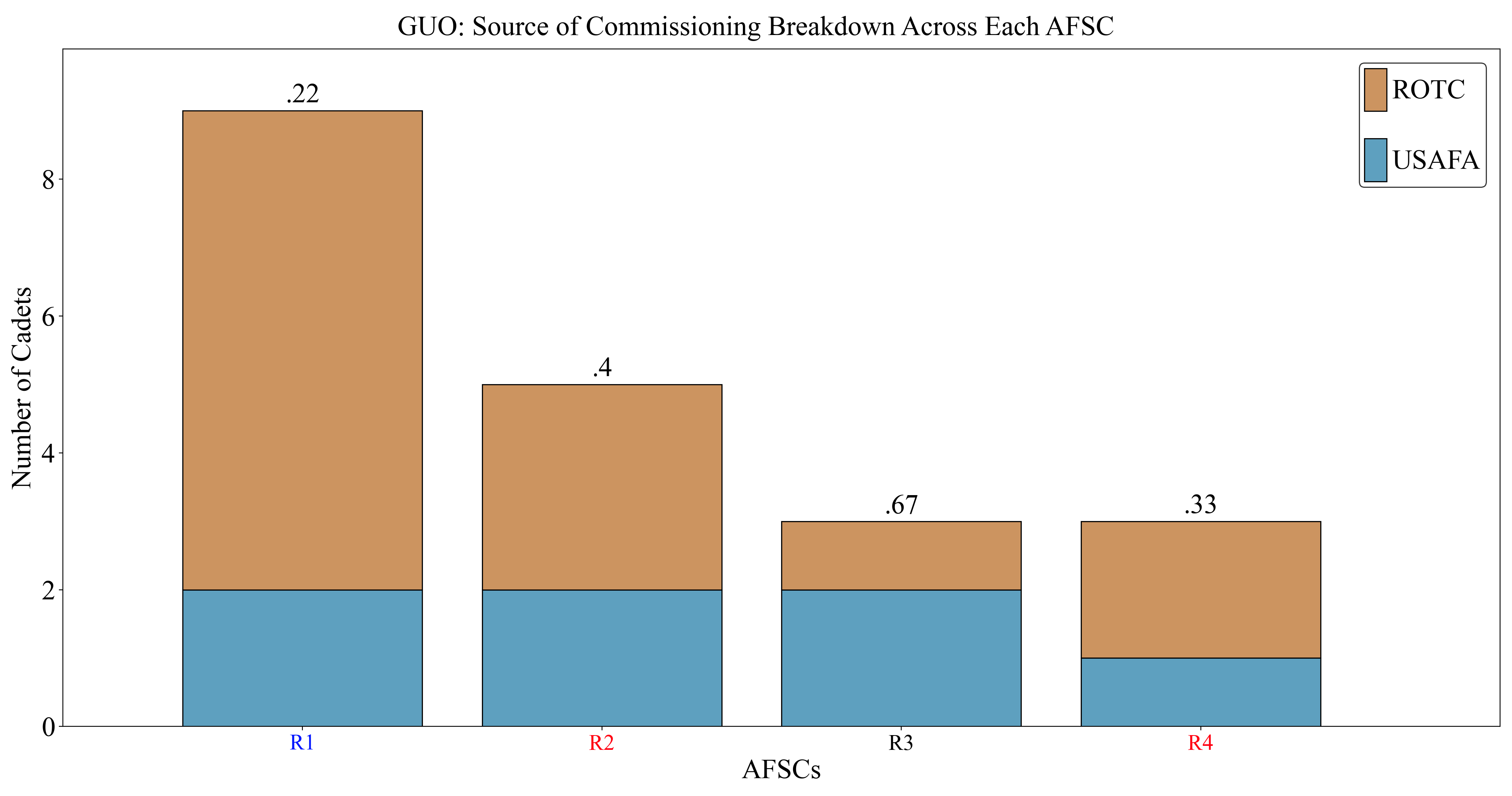
To visualize source of commissioning (SOC) breakdowns, we can do so here!
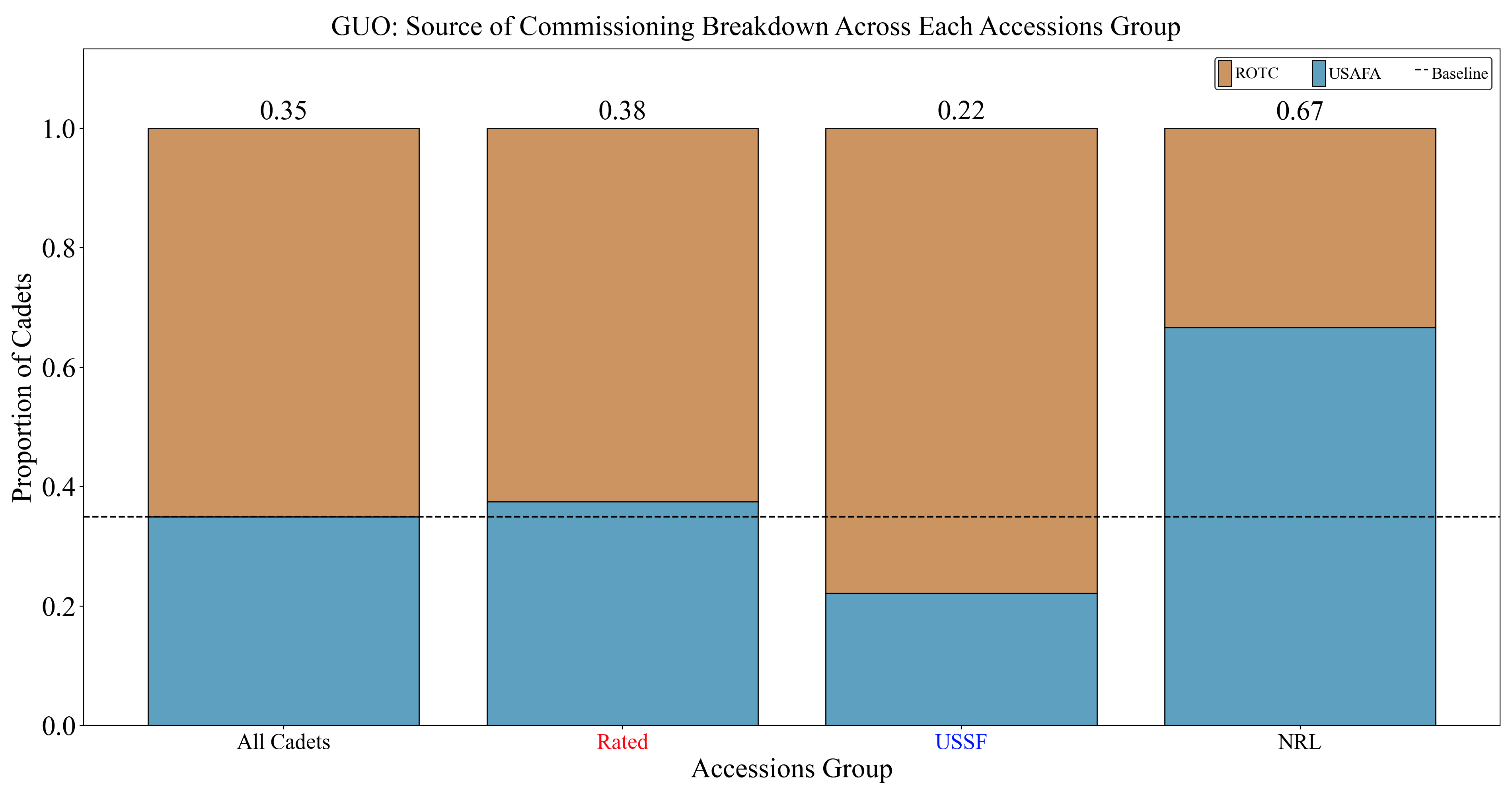
Lastly, I have a few different charts that visualize the solution by "accessions group" (Rated, USSF, NRL). Here is an example for SOC breakouts:
Automating the charts this way is a big step up from the manual, inconsistent excel graphs DSY used to do to report
the results. Now we can have a standard method of visualizing results year after year. Additionally, when one analyst
comes up with a new way of communicating their results, they can code that into afccp so everyone after them can use
that method too. It's all automated, and will work with any problem instance since the data has to be structured the
same each year.
Solution Results
Another useful function I have is the
export_solution_results()
function, which will export an Excel file containing various stats on a specific solution to this problem.
This file tracks many metrics of the entire solution set of cadets-AFSCs but also contains details
on each individual cadet outcome. Feel free to explore the file that is generated from the below code which is also in
the solution-specific folder ("GUO" in this case).
instance.export_solution_results()
💻 Console Output
Exporting solution GUO results to instances/Random_1/5. Analysis & Results/GUO/Random_1 GUO (VP).xlsx...
Done.
For reference, you can download the "Random_1 GUO (VP).xlsx" file created above here 📥.
Bubble Charts
Creating afccp has certainly been one of my proudest accomplishments as an analyst. This is how I learned python,
and I've really come to love making interesting things with this programming language! By far my greatest
visualization within this project is the "Bubble Chart". The bubble chart is a particularly creative way to visualize a
cadet-AFSC solution, if I do say so myself, and involves formulating and solving another optimization model just to
create it. Now, in order to run this function, you'll need to make sure you have the solver "cuoenne" in your
"solvers" folder. Without any further ado, here it is:
# There are many more controls to this chart, but here are a few
instance.generate_bubbles_chart({'provide_executable': True, 'redistribute_x': True,
                                 'focus': "Cadet Choice", 'b_legend_title_size': 20,
                                 'b_legend_marker_size': 20, 'b_legend_size': 20})
💻 Console Output
Creating Bubbles Chart...
Bubble Chart initialized.
Bubble Chart preprocessed.
No Sequence parameters found in solution analysis sub-folder 'GUO'.
Solving Bubbles Model instance with solver couenne...
Start Time: June 11 2025 08:36:34 AM.
Board parameters 'x' and 'y' determined through pyomo model.
Sequence parameters (J, x, y, n, s) exported to instances/Random_1/5. Analysis & Results/GUO/Board Parameters.csv
Done.
In the "GUO" folder again, we will find the "Cadet Choice.png" image which is the bubble chart we just made:
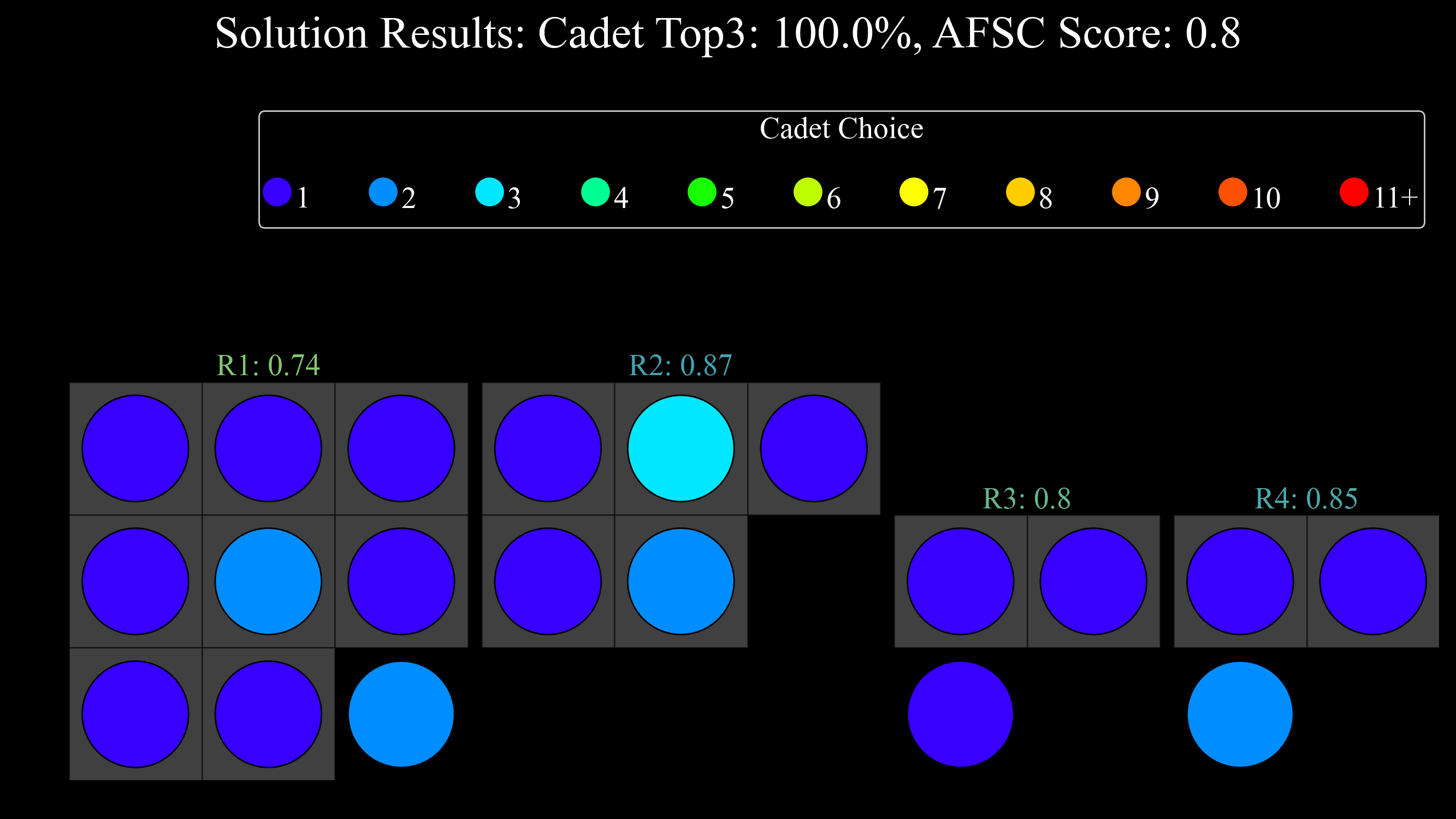
With only 4 AFSCs and 20 cadets, the bubbles chart admittedly may not be too useful. The gray squares above correspond to the PGL targets for each AFSC. The colors of the "bubbles" indicate the choice that the cadet had on that AFSC. The numbers shown for each AFSC are the normalized score index measuring how well we met the AFSC's preference.
Now, when we run the bubble chart for the first time, you will see the line of output that says
No Sequence parameters found in solution analysis sub-folder 'GUO'. The code will look for a
"Board Parameters.csv" file inside the solution sub-folder. If it does not find that file, it will know to create one.
This is when we trigger the
bubble_chart_configuration_model()
to determine the layout of the "board". Once we run the model and determine the x, y coordinates, and the size of
the boxes themselves (s) then we will export the "Board Parameters.csv" file. Anytime we want to generate another
bubble chart, it will load in those parameters. If you screw something up or just want to generate that file again for
any reason, simply delete the "Board Parameters.csv" file and the code will re-run the model like it's the first time.
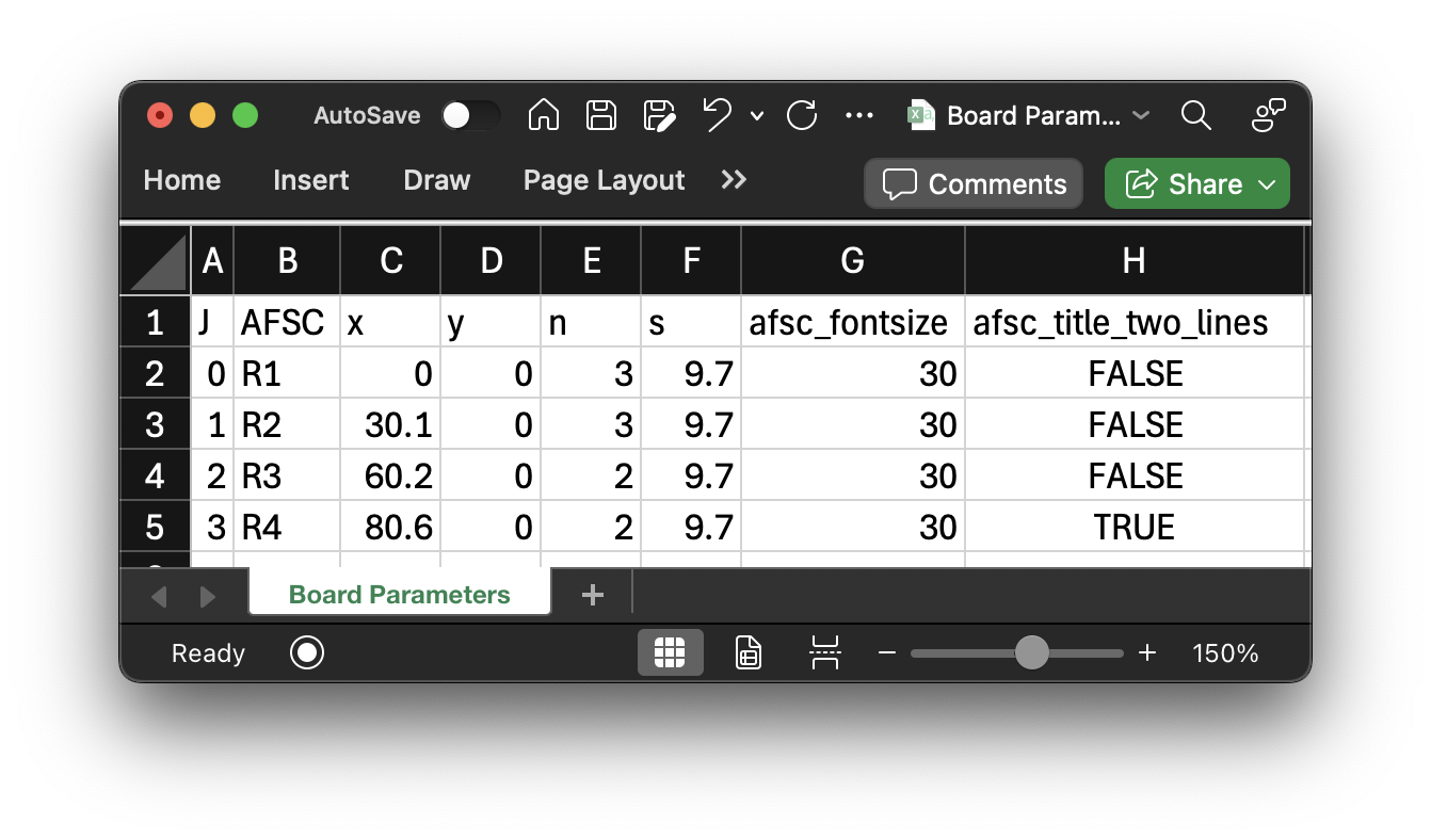
That file looks like this:

One thing we can change here is the fontsize and whether the AFSC labels should be on two lines or not. This comes in handy particularly for real class years when we have small AFSCs with long names (62EXI, for example). I'll show an example here by first modifying the "Board Parameters" to this:
And then re-generating the bubble chart, only this time, it'll import the "Board Parameters" without re-solving the optimization models.
# There are many more controls to this chart, but here are a few
instance.generate_bubbles_chart({'provide_executable': True, 'redistribute_x': True,
                                 'focus': "Cadet Choice", 'b_legend_title_size': 20,
                                 'b_legend_marker_size': 20, 'b_legend_size': 20})
💻 Console Output
Creating Bubbles Chart...
Bubble Chart initialized.
Bubble Chart preprocessed.
Sequence parameters (J, x, y, n, s) imported from instances/Random_1/5. Analysis & Results/GUO/Board Parameters.csv
Sequence parameters (J, x, y, n, s) exported to instances/Random_1/5. Analysis & Results/GUO/Board Parameters.csv
Done.

As you can see, the text above the AFSCs became bigger since the font-size increased from 20 to 30. Additionally, the last AFSC, R4, has text that spans two lines now. Again, this is useful once you've found a solution worth showing on a real problem and have created the bubble chart "board". Then you can just finesse the AFSC text specs until you get something that works.
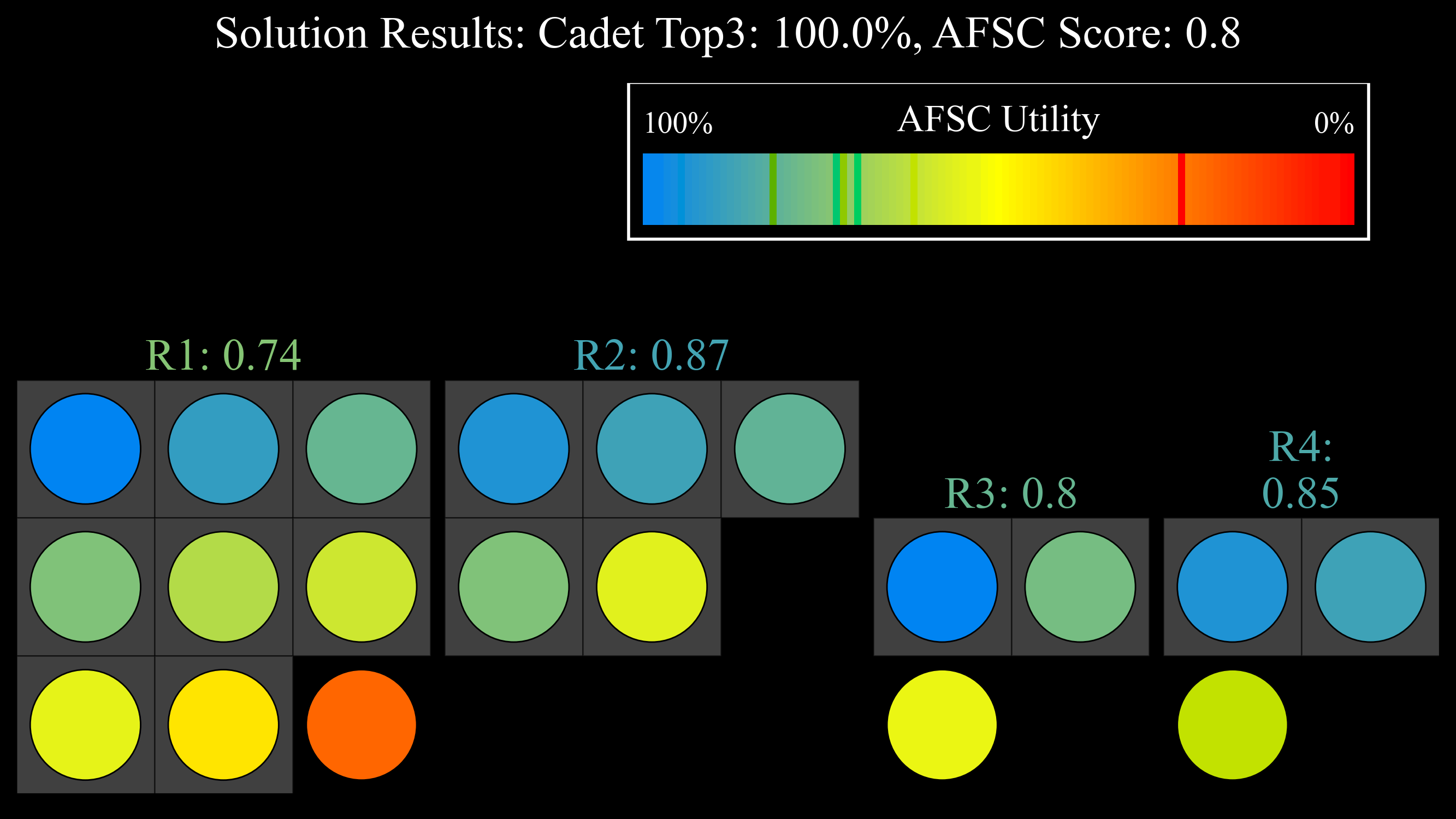
If you're wondering while the file name is "Cadet Choice.png", that's because that is the "focus" of the bubble chart. We can change this setting to "focus" on some other aspect of the solution. We can view it from the AFSC's perspective and visualize how well we gave each AFSC cadets they preferred:
# There are many more controls to this chart, but here are a few
instance.generate_bubbles_chart({'provide_executable': True, 'redistribute_x': True,
                                 'focus': "AFSC Choice", 'b_legend_title_size': 20,
                                 'b_legend_marker_size': 20, 'b_legend_size': 20})
💻 Console Output
Creating Bubbles Chart...
Bubble Chart initialized.
Bubble Chart preprocessed.
Sequence parameters (J, x, y, n, s) imported from instances/Random_1/5. Analysis & Results/GUO/Board Parameters.csv
Sequence parameters (J, x, y, n, s) exported to instances/Random_1/5. Analysis & Results/GUO/Board Parameters.csv
Done.
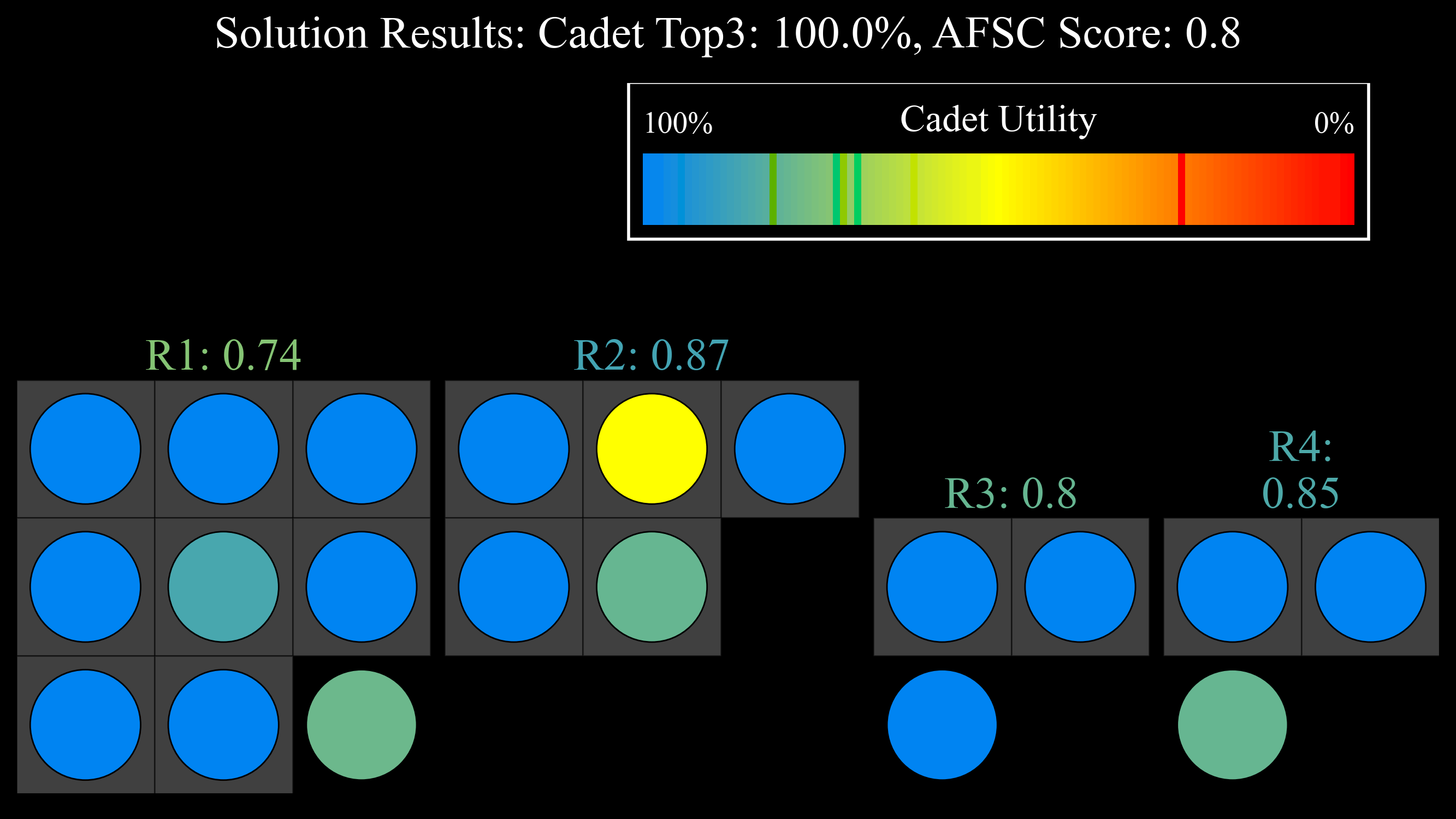
We can also show the continuous "Cadet Utility" metric for each cadet:
# There are many more controls to this chart, but here are a few
instance.generate_bubbles_chart({'provide_executable': True, 'redistribute_x': True,
                                 'focus': "Cadet Utility", 'b_legend_title_size': 20,
                                 'b_legend_marker_size': 20, 'b_legend_size': 20})
💻 Console Output
Creating Bubbles Chart...
Bubble Chart initialized.
Bubble Chart preprocessed.
Sequence parameters (J, x, y, n, s) imported from instances/Random_1/5. Analysis & Results/GUO/Board Parameters.csv
Sequence parameters (J, x, y, n, s) exported to instances/Random_1/5. Analysis & Results/GUO/Board Parameters.csv
Done.
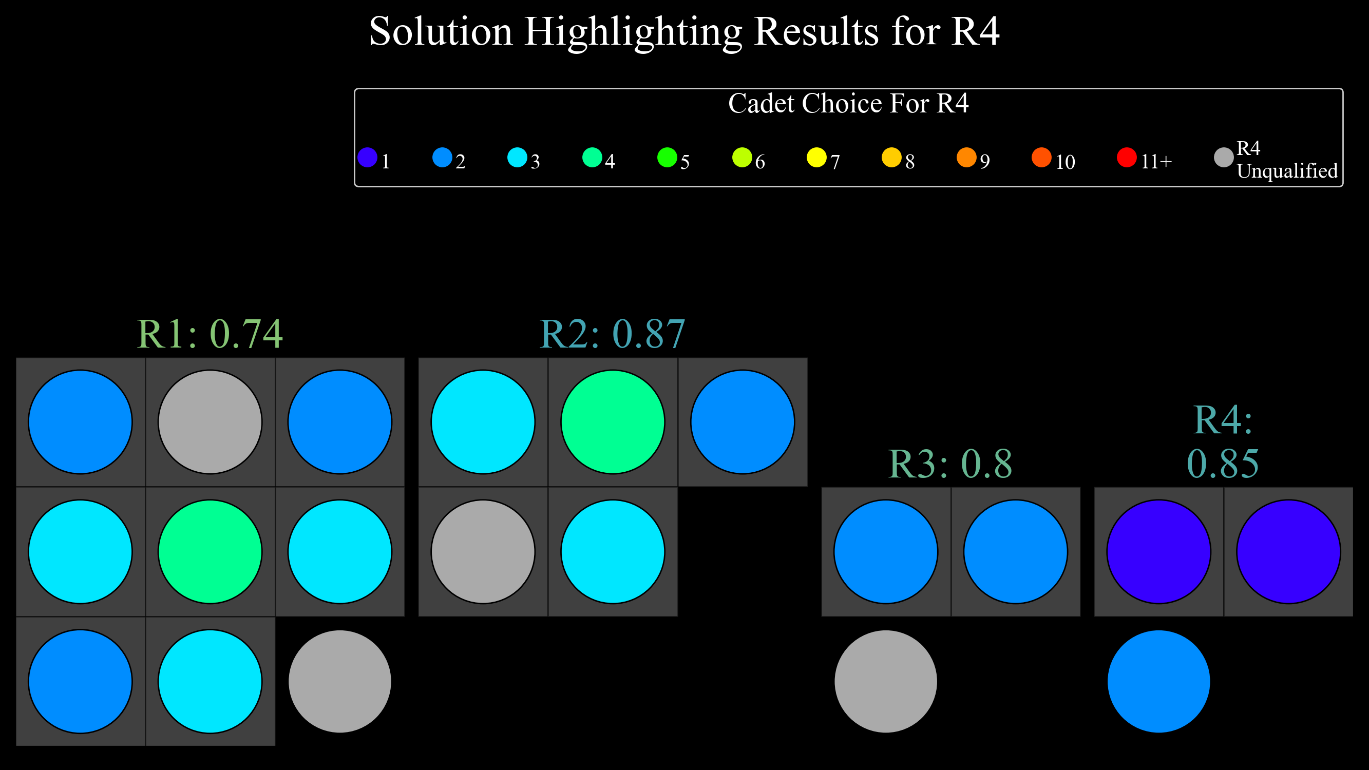
One other variant of the bubble chart I like to show allows me to focus on one specific AFSC and view the cadets' choice for that AFSC. This is helpful for undesirable career fields and also for career fields that are very hard to fill due to the lack of eligible cadets (62EXE for example). Here is an example showing cadets' choice for the AFSC "R4", with unqualified cadets shown in gray.
# There are many more controls to this chart, but here are a few
instance.generate_bubbles_chart({'provide_executable': True, 'redistribute_x': True,
                                 'focus': "Specific Choice", 'b_legend_title_size': 20,
                                 'b_legend_marker_size': 15, 'b_legend_size': 15, 'afsc': 'R4'})
💻 Console Output
Creating Bubbles Chart...
Bubble Chart initialized.
Bubble Chart preprocessed.
Sequence parameters (J, x, y, n, s) imported from instances/Random_1/5. Analysis & Results/GUO/Board Parameters.csv
Sequence parameters (J, x, y, n, s) exported to instances/Random_1/5. Analysis & Results/GUO/Board Parameters.csv
Done.
Slides
Once you've generated your charts and are thinking about putting these all into a PowerPoint, you can do so easily through one of my functions. I wanted a way to quickly generate slides, so I could communicate results in an effective, automated way. Additionally, the solution-generating process is most certainly an iterative one, and solutions change constantly. I don't want to have to manually re-generate slides everytime something changes! This method certainly serves the purpose of initializing a "final" slide-deck for a commander out-brief, but more importantly it can help communicate the quality of the results to the analyst team in a digestible manner with the execution of a single line of code. This helps facilitate the iterative part of this process!
# Regenerate the charts, this time to have them in a good format for the slides (figsize adjusted, w/no title shown)
s = instance.display_all_results_graphs(
    {'display_title': False, 'figsize': (12.25, 5.5), 'bar_text_size': 25, 'skip_afscs': False,
     'text_size': 25, 'sort_by_pgl': False})

# This will put the charts that I want in an AFPC slide-deck!
instance.generate_results_slides()
💻 Console Output
Saving all solution results charts to the corresponding folder...
<Objective 'Combined Quota' version 'quantity_bar'>
Saved Random_1 (Default) GUO Combined Quota Measure [quantity_bar] (Results).png Chart to instances/Random_1/5. Analysis & Results/GUO/.
<Objective 'Norm Score' version 'quantity_bar_proportion'>
Saved Random_1 (Default) GUO Norm Score Measure [quantity_bar_proportion] (Results).png Chart to instances/Random_1/5. Analysis & Results/GUO/.
<Objective 'Norm Score' version 'bar'>
Saved Random_1 (Default) GUO Norm Score Measure [bar] (Results).png Chart to instances/Random_1/5. Analysis & Results/GUO/.
<Objective 'Norm Score' version 'quantity_bar_choice'>
Saved Random_1 (Default) GUO Norm Score Measure [quantity_bar_choice] (Results).png Chart to instances/Random_1/5. Analysis & Results/GUO/.
<Objective 'Utility' version 'quantity_bar_proportion'>
Saved Random_1 (Default) GUO Utility Measure [quantity_bar_proportion] (Results).png Chart to instances/Random_1/5. Analysis & Results/GUO/.
<Objective 'Utility' version 'quantity_bar_choice'>
Saved Random_1 (Default) GUO Utility Measure [quantity_bar_choice] (Results).png Chart to instances/Random_1/5. Analysis & Results/GUO/.
<Objective 'Merit' version 'bar'>
Saved Random_1 (Default) GUO Merit Measure [bar] (Results).png Chart to instances/Random_1/5. Analysis & Results/GUO/.
<Objective 'USAFA Proportion' version 'quantity_bar_proportion'>
Saved Random_1 (Default) GUO USAFA Proportion Measure [quantity_bar_proportion] (Results).png Chart to instances/Random_1/5. Analysis & Results/GUO/.
<Objective 'USAFA Proportion' version 'preference_chart'>
Saved Random_1 (Default) GUO USAFA Proportion Measure [preference_chart] (Results).png Chart to instances/Random_1/5. Analysis & Results/GUO/.
<Objective 'Extra' version 'SOC Chart'>
Saved Random_1 (Default) GUO Extra Measure [SOC Chart] (Results).png Chart to instances/Random_1/5. Analysis & Results/GUO/.
<Objective 'Extra' version 'SOC Chart_proportion'>
Saved Random_1 (Default) GUO Extra Measure [SOC Chart_proportion] (Results).png Chart to instances/Random_1/5. Analysis & Results/GUO/.
<Other Charts 'Accessions Group' version 'SOC Chart'>
Saved Random_1 (Default) GUO Accessions Group [SOC Chart] (Results).png Chart to instances/Random_1/5. Analysis & Results/GUO/.

Generating results slides...
Done.
Once you've generated the slides, they'll show up in your "instances/Random_1/5. Analysis & Results/GUO/" folder as well! For reference, you can download the slide-deck for my problem instance & solution, "Random_1 GUO.pptx", created above here 📥.